Our home is our haven; the place we return to after a long day, the place we open up to our nearest and dearest, and the place where we feel most comforted.
As such, our homes should reflect us and our various personalities.
When it comes to designing, here at Roccia, we understand the importance of getting it right. Our team of design experts are always looking forward to what the next big thing will be, whilst also keeping our ears to the ground about what’s popular right now.
As such, mixing different textures and materials within a home is something that’s been going from strength to strength for a while, and it’s not something we see disappearing any time soon.
So, whether you’re looking to undergo a full renovation or just want to make a few tweaks to your abode, here are our top tips on how to use mixed materials in home design.
Mixed Materials
When mixing materials, some textures go better together than others. However, as long as there’s a common thread between the materials you’re using – such as the colour, the era you’re taking inspiration from, or the practicality of a piece, it’s bound to work.
The most basic way to mix materials is to combine a solid material with something softer, breaking up the harshness and creating a cosy place to call home.
Below, we have compiled a few ideas about how you can mix materials throughout different rooms in your house.
Kitchen 1
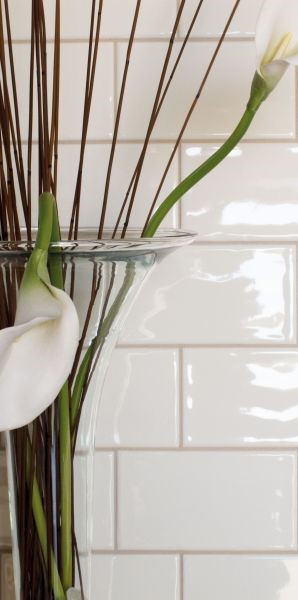
The Solid: Plain white metro tiles and wooden surfaces and furniture
The Soft: Green foliage, plants and herbs, alongside cushions on bar stools
See the look:

Why it works: The shiny, structured look of metro tiles creates an open and airy dynamic to your kitchen, while adding the practical waterproof and easy-to-clean surface that is necessary for a kitchen environment. Pairing these bright, modern, tiles with earthy tones and textures from your plants and wooden furniture creates a country-esque kitchen without adhering to the style too much.
If you want to really make a statement, living plant walls make for an amazing eye-catching area in the room.
Kitchen 2
The Solid: Wood effect tiles
The Soft: Velvet upholstered bar stools
See the look:
Why it works: Go for opulence with wood effect tiles that strike a stunning contrast between soft white coated cabinet doors and luxurious materials such as velvet and silk. The flooring is low-maintenance and easy to clean, rendering it perfect for use throughout the kitchen, and the wooden look complements the sleek white aspects of the rest of the room.
Using various materials in upholstery can add a further level of depth to the area, whilst also creating comfort and style.
Bathroom 1
The Solid: Copper components such as faucets or a radiator
The Soft: Crisp white Bath towels
Why it works: The fresh, white aesthetic of the bath towels, when contrasted against the copper piping, creates an industrial-esque vibe throughout the room, instantly adding a level of minimalist chic with little effort.
Try sticking to hushed tones when working your way around the room: light greys, glass vases and understated candles can finish off a stunning tranquil space.
Bathroom 2
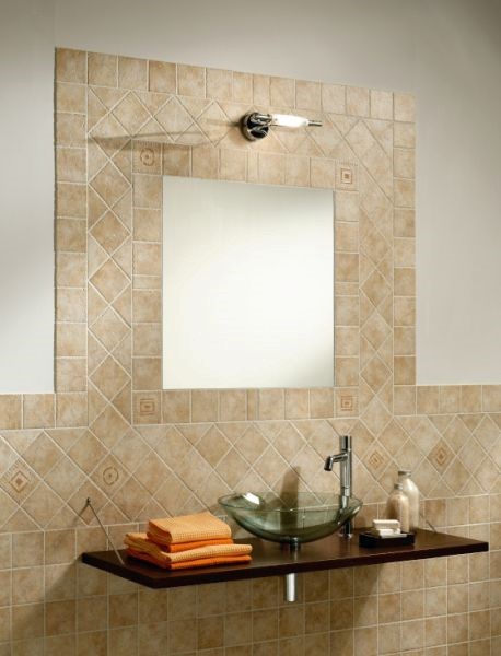
The Solid: Stone Effect Tiles
The Soft: Rope features or colourful hand towel sets
See the look:

Why it works: The contemporary statement that stone effect tiles make when styled with modern features such as varying materials like rope and glass, creates a stunning final product. Favoured for their natural tones, conflicting the hushed tones of stone effect tiles with bright, vibrant colours can evoke a more modern style in your bathroom – a trend that continues to thrive year on year.
Living Room 1
The Solid: Tile the fireplace you no longer use for a stylish way to keep your mantel
The Soft: Accessories, wall art, cushions
Why it works: The complementary tones, the soft furnishings, the varied textures: all working harmoniously together to create a beautiful, romantic theme in the living room. Modern yet chic, stylish yet understated – guests will be begging to stay longer.
Top tip: opting for bold pieces of minimalist art can pay off massively, but don’t forget about the frame.
Living Room 2
The Solid: Slate effect tiles
The Soft: Faux fur throws and flowers
Why it works: The smooth, slate effect tiles instil an earthy tone to the room, which is balanced by the fluffy texture of the faux fur throw. Durable, stylish and easy to install, the slate effect tiles are designed to stand the test of time, and when used effectively, can take the room from drab to fab.
For a bolder look, mix geometric patterns amidst the floral undertones on cushions.
Bedroom 1
The Solid: Wooden bedside table
The Soft: Cushions, blankets and fluffy rugs
Why it works: More often than not, we are told that over accessorising an area can be too much. However, opting for a variety of materials and textures when styling an area can prove most effective, as highlighted above. The sharp contemporary feel of the units, paired with the patterns used on the bedding, completed with the fluffy rug…simply lovely!
Don’t forget that wall art can be more than two dimensional: here, mixed materials can really stand out.
Bedroom 2
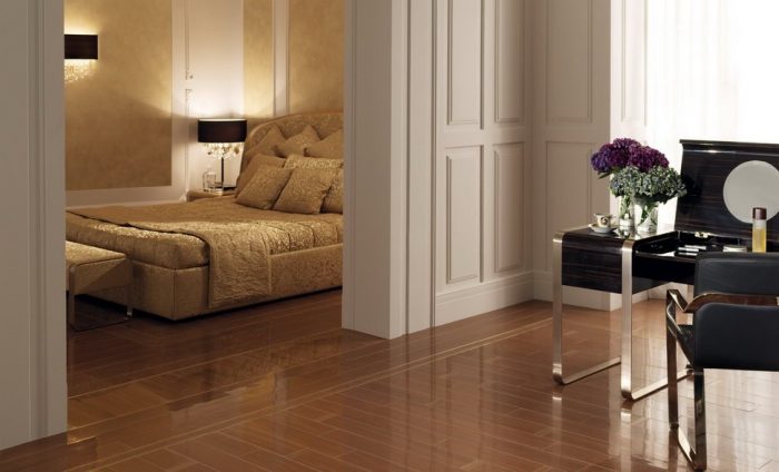
The Solid: Wrought Iron dressing table set
The Soft: Luxurious silk sheets
See the look:

Why it works: Opulent silk sheets are always a style winner, and when it comes to the bedroom, comfort and luxury are of maximum importance. Mixing hard components such as wrought iron, with soft materials like silk creates an enviable dynamic.
For more inspiration on how to style mixed materials in 2018, download our ebrochure today.
Alternatively, pop into one of our showrooms to take a look for yourself.


Leave a comment
This site is protected by hCaptcha and the hCaptcha Privacy Policy and Terms of Service apply.