The colour scheme you choose for your kitchen significantly affects your space’s overall look and feel, which is why you must take the time to carefully consider what it will be. Not only will it provide some of the ambience for your room, but it can alter the appearance of the size of the space when used correctly.
Choosing your colour scheme is a big decision. Once you have an idea for the aesthetic that you want your kitchen to have, you can begin researching the colour palette to use to best suit your room. Today, we’re looking into how to choose the best kitchen colour scheme for a modern home. We’re exploring contemporary colour pallets, and how the team here at Roccia can help you inject some luxury through the shades and tones you select for your kitchen.
Tie In Your Kitchen Colour Scheme With the Rest of Your Modern Home
Ensuring that your kitchen colour scheme fits in well with the rest of your home is the first step to creating a modern space you’re proud to show off. Whilst you may not want the same palette for every room in your home, choosing compatible colours that tie in nicely with each other is a fantastic design choice. This will guarantee that your home feels like a complete picture instead of several different aesthetics jumbled together, which can feel messy and unorganised. Create a finished puzzle by harmonising your colour schemes with complementary shades and tones from our range of luxury kitchen brands.
Choosing Between Bold or Subtle
Whilst choosing a bold colour palette may seem daunting to some, it’s always a good idea to step out of your comfort zone and explore new ideas. Many modern kitchen trends incorporate bright colours such as blue and green, that when used alongside neutral shades like cream and white, create a stunning contemporary look.
In contrast, if you’re not feeling brave enough or just prefer to keep things neutral, there’s nothing wrong with choosing a beige, grey, or white colour scheme as it provides a clean aesthetic that many modern homes possess.

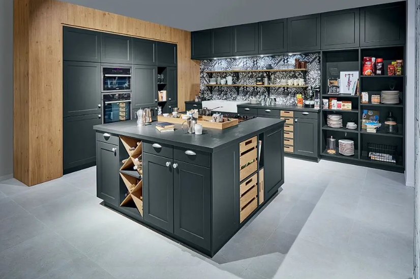
Moody Charcoal
While we have seen a lot of different greys in recent interior design trends, the most popular have been shades of light and airy grey. However, if you want to create a modern look in your kitchen with a twist, then opt for moody charcoal instead. This colour acts as a strong accent in any space it is implemented into and can help to create a sleek and dramatic look perfect for those looking to make an impact with their colour scheme.
Choose your fixtures and fittings in this deep tone, or opt for charcoal ceramic kitchen wall tiles to add more dimension to your modern space.

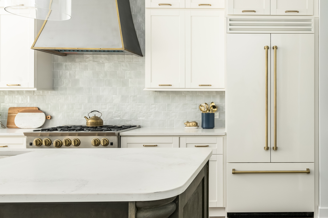
White Paired with Gold Accents
Nothing says class like white and gold. This timeless colour combination has found its way into kitchen design, and we couldn’t be more excited. If you’re looking for a luxury touch to your space, this is the colour scheme your kitchen needs to shine.
White is a tone that will never go out of style, so it is a fantastic choice for those looking for longevity with their kitchen design. All you need to do is switch out the accents to keep it modern and fresh-looking, which is where the gold comes in. Gold is the most glamorous colour there is and will no doubt transform your kitchen into the perfect hosting and entertainment space.
To bring more of your luxurious side out in your kitchen, choose our Versace tiles for your floors or walls. These will help you create the opulent room you’ve been dreaming of and look beautiful when paired with your white and gold fittings.
Natural Sage Green
Bring a piece of nature into your home with a sage green colour palette. We are thrilled that this natural tone has crept its way into recent kitchen design trends as we feel it’s the perfect colour that both reflects relaxation and sparks inspiration for your culinary masterpieces.
Sage green is ideal for family kitchens as it helps to create a cosy and homely feel, much like you would find in a traditional farmhouse kitchen. Pair natural sage green wall tiles with white wooden cabinets to capture the essence of a country house kitchen no matter where your home is, in the countryside or a bustling city.

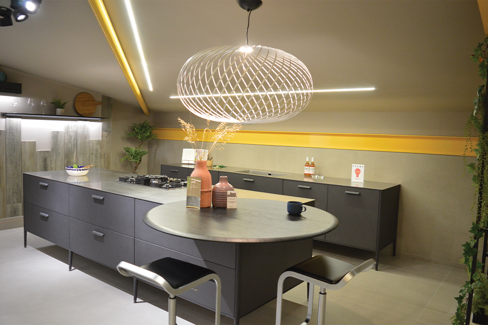
A Pop of Colour
If you’re looking to brighten up your kitchen, then a simple pallet with one pop of colour is a great way to do this, and our Cesar kitchens do this perfectly. They have mastered the art of subtle colour by combining the moody charcoal explored earlier, with a bright burst of energy in the form of a bold pink or yellow, for example.
This helps to create a sleek yet fun space, ideal for a wide range of different people. However, we understand it can be quite daunting to create this look on your own, which is why our award-winning kitchen design team are here to help you.


Leave a comment
This site is protected by hCaptcha and the hCaptcha Privacy Policy and Terms of Service apply.